Custom URL complications
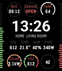
Put your own data on a Sorta Modular watchface with a tiny JSON response from any URL you control, rendered natively on the watch.
Point any slot at an HTTP endpoint.
The phone fetches it on a schedule you control, validates the response, and pushes the result to the watch.
The watch renders it with the same renderers the built-in complications use.
Refresh is clamped to at most once per 5 minutes so misbehaving script can’t drain the battery.
How it works
- Serve JSON. Any HTTP endpoint that returns a small JSON document works: a Node/Python/PHP script, a Home Assistant template, or a static file behind any web server.
- Point a slot at it. In the watchface settings, set a circle, the center slot, or a bezel edge to Custom URL and paste your URL into its Widget URL field.
-
The watch renders it. The phone fetches on
watchface launch and on settings changes, then re-fetches
per the
refreshyou return. The last good widget is cached.
To quickly get started run the
sample service
(node server.js) and point a slot at
http://<your-computer>:8090/. A minimal
endpoint of your own is a few lines:
// hello.js - the smallest possible widget service
require('http').createServer(function (req, res) {
  res.writeHead(200, { 'Content-Type': 'application/json' });
  res.end(JSON.stringify({
    v: 1,
    refresh: 600,
    widget: { type: 'text', label: 'HELLO', value: 'WORLD' }
  }));
}).listen(8090);
The request
The phone appends query parameters to your URL, so one endpoint can serve every slot:
GET <your-url>?v=1&slot=circle&time=1783286288&tzoff=120&units=c| Param | Meaning |
|---|---|
v |
Protocol version, currently 1. |
slot |
circle, center or
bezel - which geometry is asking. A script
serving several placements branches on this; it is never
told which circle or edge.
|
time |
Current time as epoch seconds. |
tzoff |
The phone’s UTC offset in minutes east (e.g.
120 for UTC+2, -300 for
UTC−5).
|
units |
c or f - the watchface’s
temperature unit setting.
|
The response
Respond with any 2xx status and a JSON body under 4 KB:
{
  "v": 1,
  "refresh": 600,
  "widget": { "type": "...", ... }
}| Field | Meaning | |
|---|---|---|
v |
required |
Must be 1. Anything else is treated as a
failed fetch, so old watchface versions degrade
gracefully against newer scripts.
|
refresh |
optional |
Seconds until the next fetch. Clamped to
[300, 86400] (5 minutes to 24 hours),
default 1800.
|
widget |
one of the two |
One of the templates below. Its type must
fit the slot geometry that made the request. Shorthand
for a one-entry timeline that is active
immediately.
|
timeline |
one of the two |
Dated widgets for the hours ahead, flipped locally by
the phone - see Timelines. A
response carries exactly one of widget or
timeline.
|
Two rules apply everywhere:
- All or nothing. Any invalid field rejects the whole payload and the watch keeps its cached widget - there are no partial renders. Overlong strings are the exception: they are truncated, not rejected. Out-of-range numbers are clamped.
-
Colors are
"#RRGGBB". They are quantized to the watch’s 64-color palette; omitted means white. Night mode overrides every color to red.
Circle · text
The six round slots (top and bottom rows) are 44 px
circles. The text template shows a small label on
top and a big value - the same renderer the built-in date
complication uses.
| Field | Meaning | |
|---|---|---|
value |
required | The big text. Up to 8 characters; 4–5 fit comfortably. |
label |
optional | Small caption above the value. Up to 10 characters, but the circle only fits about 5 - keep it short. |
color |
optional | Colors the value text. |
{
  "v": 1,
  "refresh": 600,
  "widget": {
    "type": "text",
    "label": "BUS",
    "value": "09:12"
  }
}
{
  "v": 1,
  "refresh": 900,
  "widget": {
    "type": "text",
    "label": "GARAGE",
    "value": "OPEN",
    "color": "#FF5500"
  }
}
{
  "v": 1,
  "widget": {
    "type": "text",
    "value": "42"
  }
}
refresh and
label omitted
Circle · gauge
A horseshoe scale around the circle with a dot at
percent, and optional text in the middle - the look
of the built-in weather and UV bands.
| Field | Meaning | |
|---|---|---|
percent |
required | Dot position, 0–100. |
value |
optional | Center text, up to 8 characters. |
label |
optional | Small caption above the value. |
color |
optional |
Colors the scale (when colors is absent).
|
colors |
optional |
Up to 8 { "to", "color" } segments. Each
paints the scale from the previous segment’s end up to
its to percent - like the UV band’s risk
colors. to values must not decrease.
|
{
  "v": 1,
  "refresh": 1800,
  "widget": {
    "type": "gauge",
    "label": "TANK",
    "value": "64",
    "percent": 64
  }
}
{
  "v": 1,
  "refresh": 900,
  "widget": {
    "type": "gauge",
    "label": "SOLAR",
    "value": "3.1kW",
    "percent": 78,
    "color": "#FFAA00"
  }
}
{
  "v": 1,
  "refresh": 600,
  "widget": {
    "type": "gauge",
    "label": "CO2",
    "value": "612",
    "percent": 27,
    "colors": [
      {
        "to": 50,
        "color": "#55FF00"
      },
      {
        "to": 75,
        "color": "#FFAA00"
      },
      {
        "to": 100,
        "color": "#FF0000"
      }
    ]
  }
}
Center · columns
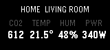
The center slot is the wide area under the time: an info line on
top and a 152×46 px content area. The
columns template is the weather-station look - 2 to
5 label/value pairs.
| Field | Meaning | |
|---|---|---|
columns |
required |
2–5 objects of { "label", "value" }. Labels
fit 6 characters, values 8.
|
info |
optional | The info line above, up to 30 characters. |
color |
optional | Colors the values. |
{
  "v": 1,
  "refresh": 300,
  "widget": {
    "type": "columns",
    "info": "HOME  LIVING ROOM",
    "columns": [
      {
        "label": "CO2",
        "value": "612"
      },
      {
        "label": "TEMP",
        "value": "21.5°"
      },
      {
        "label": "HUM",
        "value": "48%"
      },
      {
        "label": "PWR",
        "value": "340W"
      }
    ]
  }
}
Center · lines
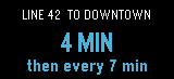
Two free-text lines in the center slot - a big first line and a smaller second one.
| Field | Meaning | |
|---|---|---|
line1 |
required | The big line, up to 14 characters. |
line2 |
optional | The small line, up to 18 characters. |
info |
optional | The info line above, up to 30 characters. |
color |
optional | Colors both lines. |
{
  "v": 1,
  "refresh": 300,
  "widget": {
    "type": "lines",
    "info": "LINE 42  TO DOWNTOWN",
    "line1": "4 MIN",
    "line2": "then every 7 min",
    "color": "#00AAFF"
  }
}
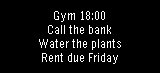
Center · textarea
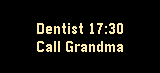
The whole center block - info line included - becomes one free
text area. Newlines (\n) start new lines,
everything else wraps and centers itself. Short text renders in
the bold font; when it doesn’t fit, the face drops to the small
font automatically. About 79 characters fit.
| Field | Meaning | |
|---|---|---|
text |
required |
The text. Newlines are honored; longer text wraps.
Truncated at 79 characters. There is no
info field - the info line belongs to the
text area.
|
color |
optional | Colors the whole text. |
{
  "v": 1,
  "refresh": 900,
  "widget": {
    "type": "textarea",
    "text": "Dentist 17:30\nCall Grandma",
    "color": "#FFD500"
  }
}
{
  "v": 1,
  "refresh": 900,
  "widget": {
    "type": "textarea",
    "text": "Gym 18:00\nCall the bank\nWater the plants\nRent due Friday"
  }
}
Bezel · gauge
The left and right screen edges are 0–100 rulers that fill from the bottom, each an independent slot. There is exactly one template and no text - the edge has nowhere to put it.
| Field | Meaning | |
|---|---|---|
percent |
required | Fill level, 0–100. |
color |
optional | Colors the fill. Omitted, the edge falls back to its Custom Edge Color setting or the accent color. |
{
  "v": 1,
  "refresh": 600,
  "widget": {
    "type": "gauge",
    "percent": 62,
    "color": "#55FF00"
  }
}
{
  "v": 1,
  "refresh": 600,
  "widget": {
    "type": "gauge",
    "percent": 35
  }
}
Timelines
A script often knows more than the current value - a transit
script knows the whole morning’s departures. Instead of a single
widget, return a timeline: dated
widgets for the hours ahead. The phone stores the list and flips
the active entry at each at boundary.
A flip is a message to the watch, not a network
fetch
- a timeline fetched once on wifi keeps flipping with no
connectivity, and minute-accurate changes don’t fight the
5-minute fetch floor: fetch hourly, flip by the minute.
-
Up to 24 entries.
atis epoch seconds; entries must be sorted ascending and at least 60 seconds apart (the face ticks by the minute). -
The active entry is the latest one with
at≤ now. Before the first entry goes active, the slot keeps its cached widget or placeholder. - Every entry must be a valid widget for the slot’s geometry - one bad entry rejects the whole payload.
-
Each fetch replaces the whole timeline, so
refreshis your revision cadence: hand over the rest of the day as you currently believe it, correct it on the next fetch.
{
  "v": 1,
  "refresh": 3600,
  "timeline": [
    {
      "at": 1783065600,
      "widget": {
        "type": "text",
        "label": "BUS",
        "value": "09:12"
      }
    },
    {
      "at": 1783066320,
      "widget": {
        "type": "text",
        "label": "BUS",
        "value": "09:31"
      }
    },
    {
      "at": 1783067460,
      "widget": {
        "type": "text",
        "label": "BUS",
        "value": "09:54"
      }
    }
  ]
}
at passed - each
earlier departure showed until its successor went active
The
sample service’s /timeline endpoint serves a live version of
this: the next six departures in one response, revised hourly.
Rules & gotchas
- Timeout & size: responses must arrive within 10 seconds and stay under 4096 bytes.
-
Caching: the last good widget is cached per
slot and survives fetch failures and watch reinstalls. When
a widget’s age exceeds 3× its
refresh, it renders dimmed; a failure with no cache shows a placeholder glyph, never a blank slot. - Changing the URL in settings drops that slot’s cache immediately - stale data from the old script never shows as current.
- Refresh floor: you can’t be fetched more often than every 5 minutes, whatever you return. For minute-accurate changes (countdowns, departures), return a timeline - entry flips are local and free.
- Night mode renders the whole face - your widgets included - in red, ignoring your colors.
- Unknown fields in the envelope or widget are ignored, so you can keep extra bookkeeping in the same document.
Full JSON schema
The formal contract, as JSON Schema (2020-12). The branch of
widget your response may use is decided by the
slot parameter of the request:
$defs/circleWidget,
$defs/centerWidget or
$defs/bezelWidget. A document valid against the
right geometry is always accepted; the phone is slightly more
lenient than the schema.
custom-url-response.schema.json (standalone file)
{
  "$schema": "https://json-schema.org/draft/2020-12/schema",
  "title": "Sorta Modular Custom URL response",
  "type": "object",
  "required": ["v"],
  "oneOf": [
    { "required": ["widget"] },
    { "required": ["timeline"] }
  ],
  "properties": {
    "v": {
      "const": 1,
      "description": "Protocol version."
    },
    "refresh": {
      "type": "number",
      "minimum": 300,
      "maximum": 86400,
      "default": 1800,
      "description": "Seconds until the next fetch."
    },
    "widget": {
      "$ref": "#/$defs/widget",
      "description": "What to show now. Shorthand for a one-entry timeline active immediately."
    },
    "timeline": {
      "type": "array",
      "minItems": 1,
      "maxItems": 24,
      "description": "Dated widgets; 'at' ascending, entries >= 60 s apart. The latest entry with at <= now is shown.",
      "items": {
        "type": "object",
        "required": ["at", "widget"],
        "properties": {
          "at": {
            "type": "number",
            "description": "Epoch seconds this entry becomes active."
          },
          "widget": { "$ref": "#/$defs/widget" }
        }
      }
    }
  },
  "$defs": {
    "widget": {
      "anyOf": [
        { "$ref": "#/$defs/circleWidget" },
        { "$ref": "#/$defs/centerWidget" },
        { "$ref": "#/$defs/bezelWidget" }
      ],
      "description": "Must match the geometry of the requesting slot."
    },
    "color": {
      "type": "string",
      "pattern": "^#[0-9a-fA-F]{6}$",
      "description": "Quantized to the watch's 64-color palette; default white."
    },
    "circleWidget": {
      "oneOf": [
        {
          "type": "object",
          "required": ["type", "value"],
          "properties": {
            "type": { "const": "text" },
            "value": { "type": "string", "maxLength": 8 },
            "label": { "type": "string", "maxLength": 10 },
            "color": { "$ref": "#/$defs/color" }
          }
        },
        {
          "type": "object",
          "required": ["type", "percent"],
          "properties": {
            "type": { "const": "gauge" },
            "percent": { "type": "number", "minimum": 0, "maximum": 100 },
            "value": { "type": "string", "maxLength": 8 },
            "label": { "type": "string", "maxLength": 10 },
            "color": { "$ref": "#/$defs/color" },
            "colors": {
              "type": "array",
              "minItems": 1,
              "maxItems": 8,
              "description": "Scale segments; 'to' values must not decrease.",
              "items": {
                "type": "object",
                "required": ["to", "color"],
                "properties": {
                  "to": { "type": "number", "minimum": 0, "maximum": 100 },
                  "color": { "$ref": "#/$defs/color" }
                }
              }
            }
          }
        }
      ]
    },
    "centerWidget": {
      "oneOf": [
        {
          "type": "object",
          "required": ["type", "line1"],
          "properties": {
            "type": { "const": "lines" },
            "line1": { "type": "string", "maxLength": 14 },
            "line2": { "type": "string", "maxLength": 18 },
            "info": { "type": "string", "maxLength": 30 },
            "color": { "$ref": "#/$defs/color" }
          }
        },
        {
          "type": "object",
          "required": ["type", "text"],
          "properties": {
            "type": { "const": "textarea" },
            "text": {
              "type": "string",
              "maxLength": 79,
              "description": "Fills the whole block; newlines start new lines. No info field."
            },
            "color": { "$ref": "#/$defs/color" }
          }
        },
        {
          "type": "object",
          "required": ["type", "columns"],
          "properties": {
            "type": { "const": "columns" },
            "columns": {
              "type": "array",
              "minItems": 2,
              "maxItems": 5,
              "items": {
                "type": "object",
                "required": ["label", "value"],
                "properties": {
                  "label": { "type": "string", "maxLength": 6 },
                  "value": { "type": "string", "maxLength": 8 }
                }
              }
            },
            "info": { "type": "string", "maxLength": 30 },
            "color": { "$ref": "#/$defs/color" }
          }
        }
      ]
    },
    "bezelWidget": {
      "type": "object",
      "required": ["type", "percent"],
      "properties": {
        "type": { "const": "gauge" },
        "percent": { "type": "number", "minimum": 0, "maximum": 100 },
        "color": { "$ref": "#/$defs/color" }
      }
    }
  }
}
Sample projects
-
examples/custom-url-service
- a zero-dependency Node server with an endpoint for every
template, plus deliberately broken endpoints
(
/bad,/slow) to see the caching behavior. The best starting point for your own script. - examples/home-assistant - a Home Assistant custom component that exposes your entities as widget endpoints on your LAN.